Restyle & relaunch of “Living is Life” magazine
“Living is life” is an hybrid bimonthly magazine, which deals with architecture/design and lifestyle in the Varese/Milan area and surrounding. It promotes “glamorous living” and has a contemporary look on the world of design. The target is a transversal audience of design enthusiasts and lovers of beauty, offering escape and curiosity by entering the dream homes of local celebrities and star architects.
The objective was to give greater refinement and sophistication to the graphic details and give the format more contemporaneity and lightness.
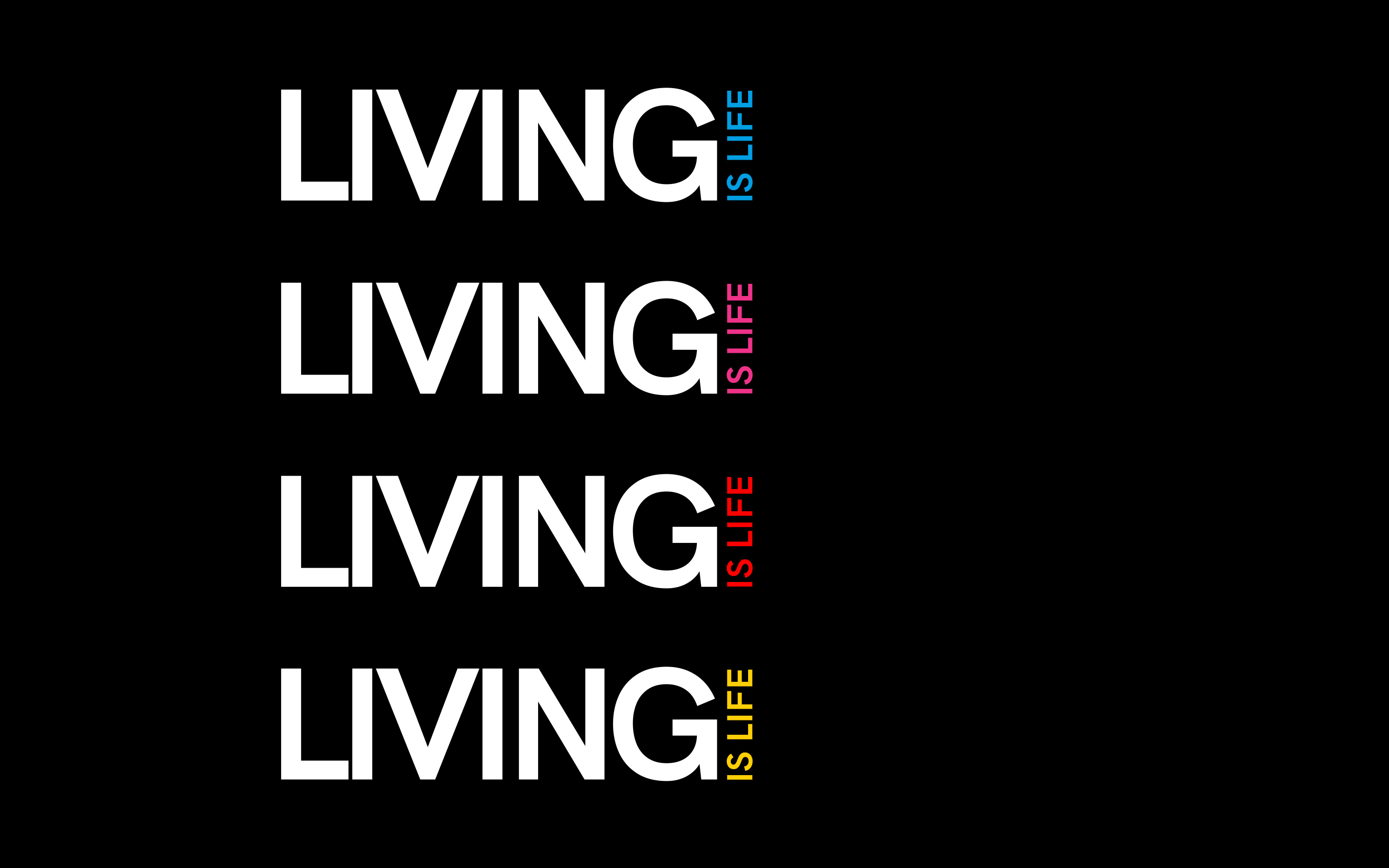
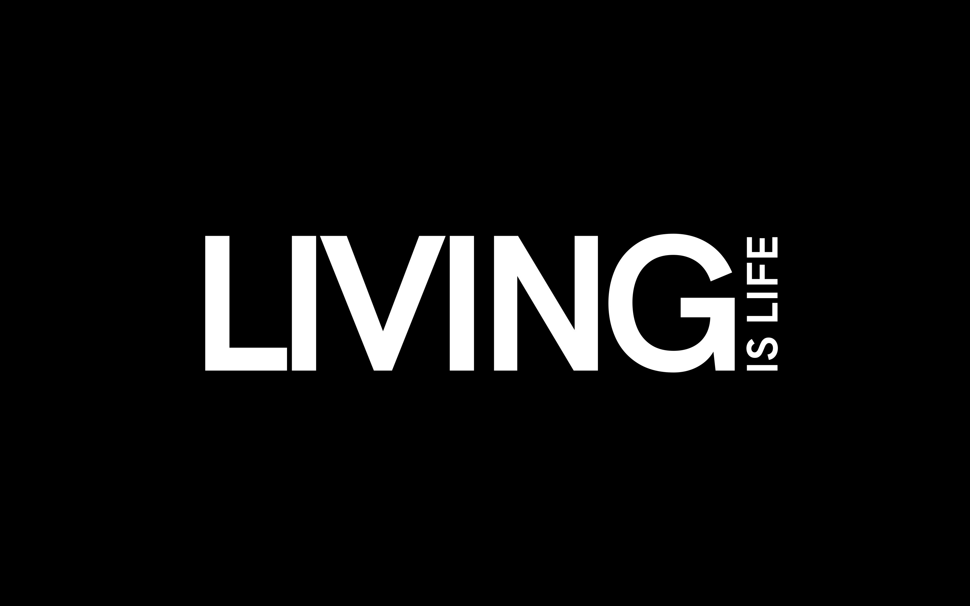
Logo
Sans serif lettering with a clean and neutral character immediately recalls the design system.
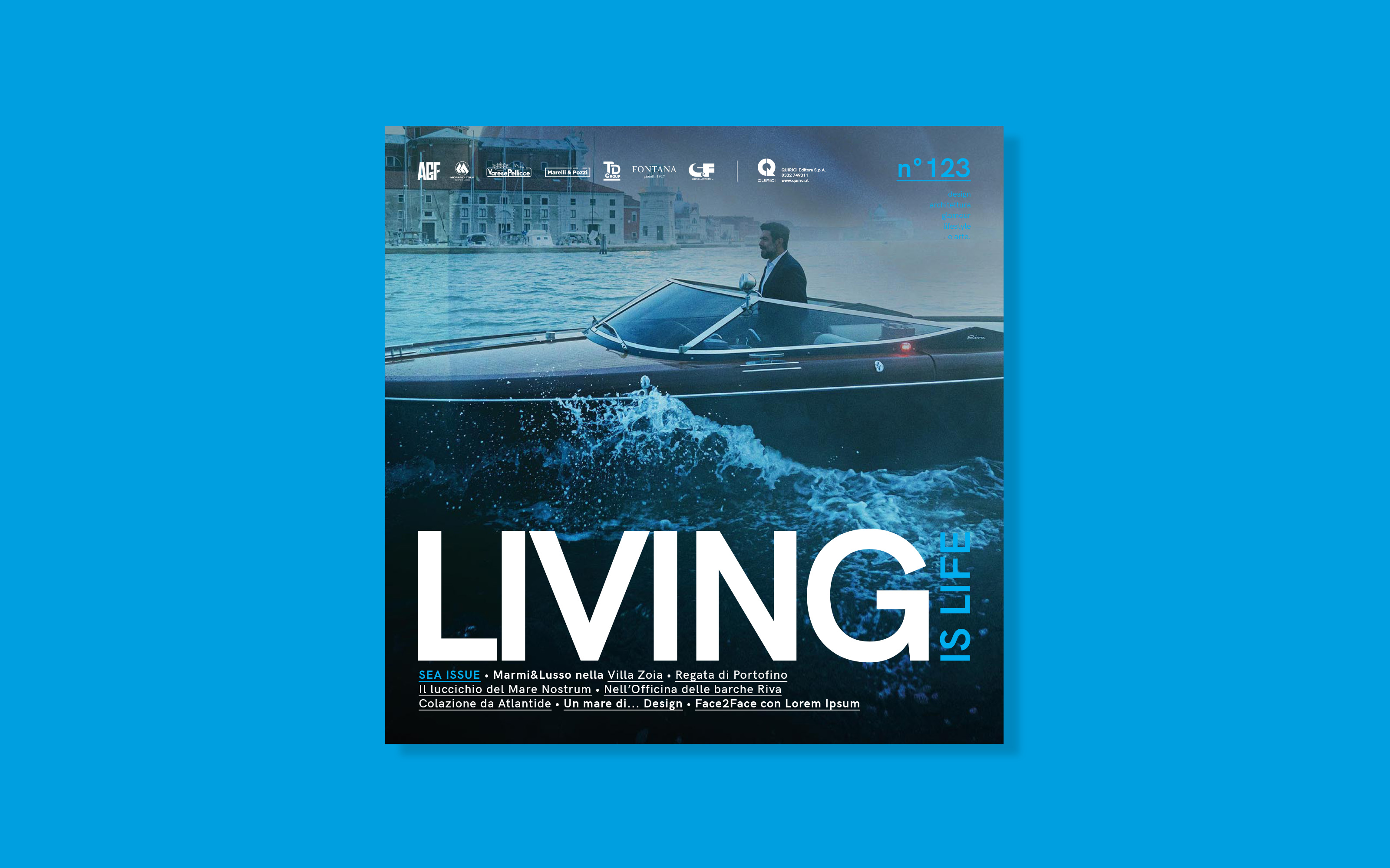
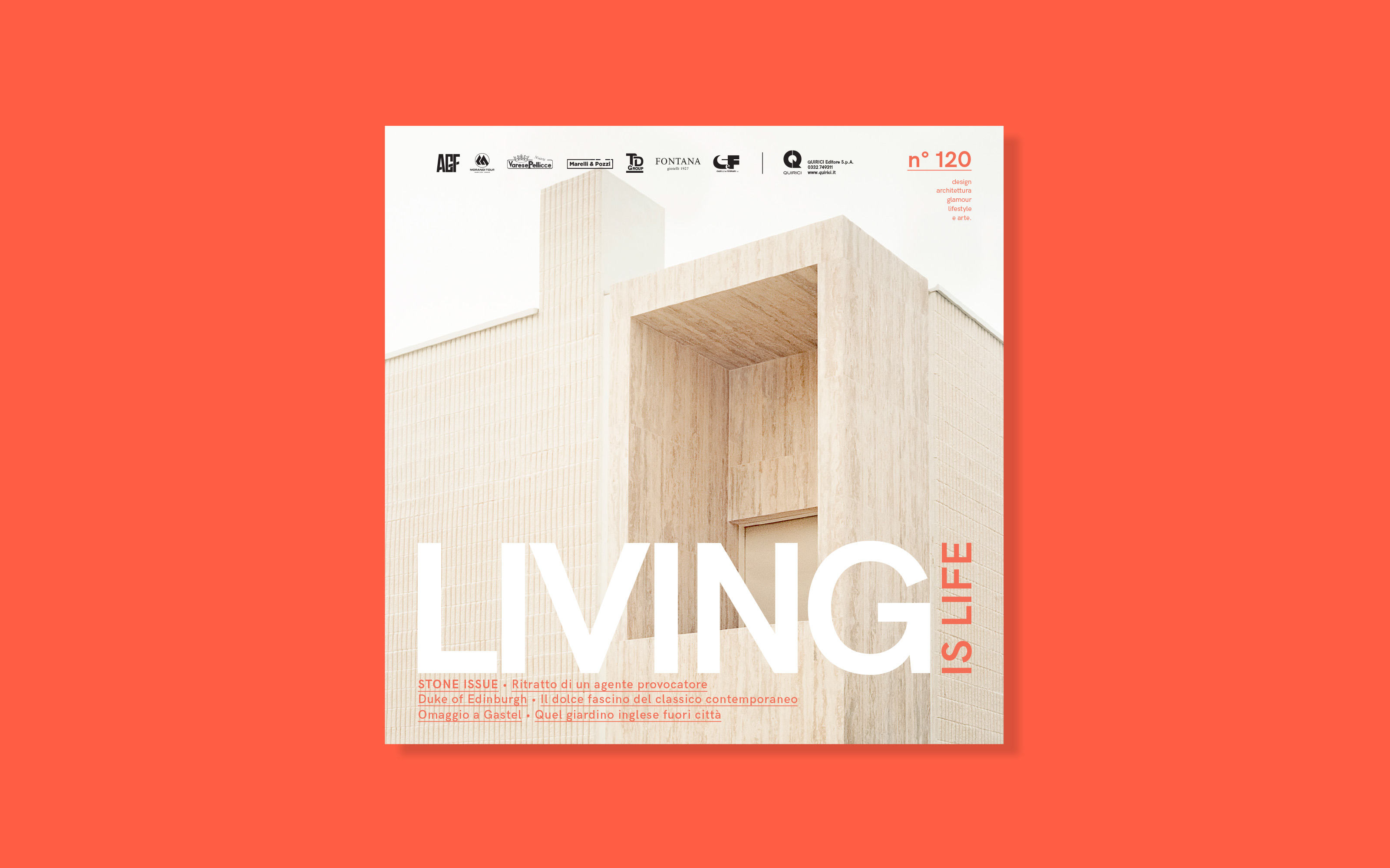
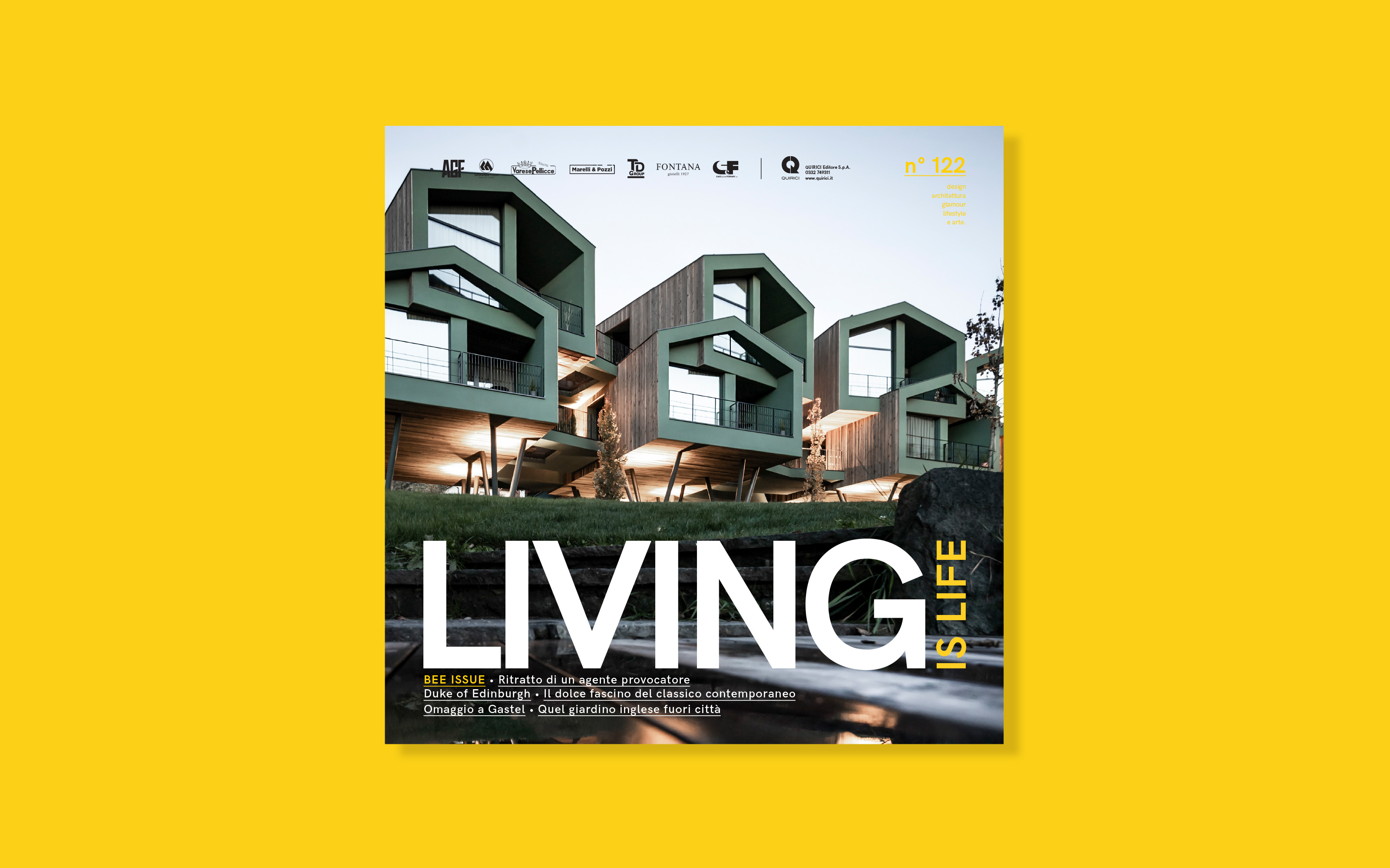
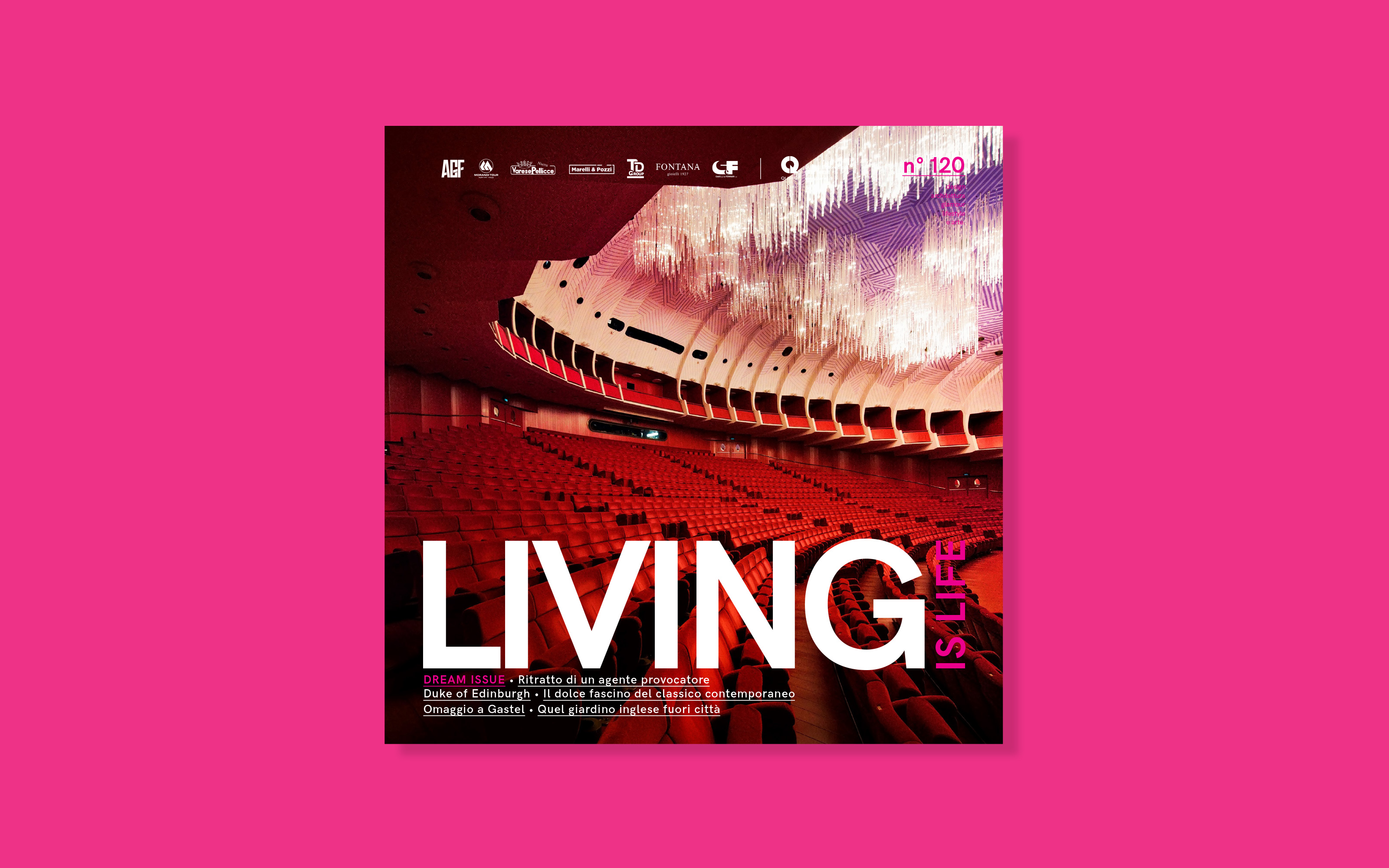
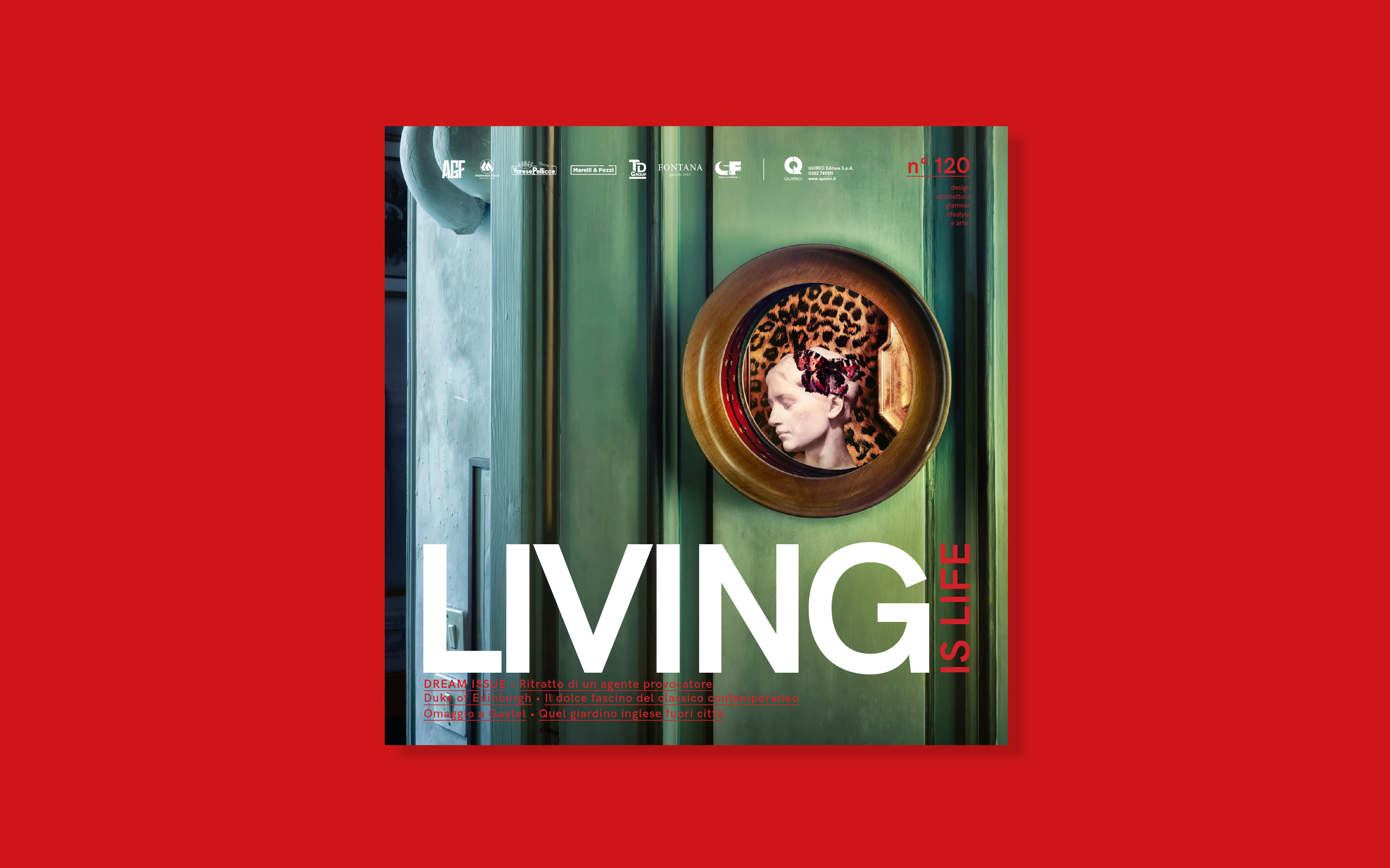
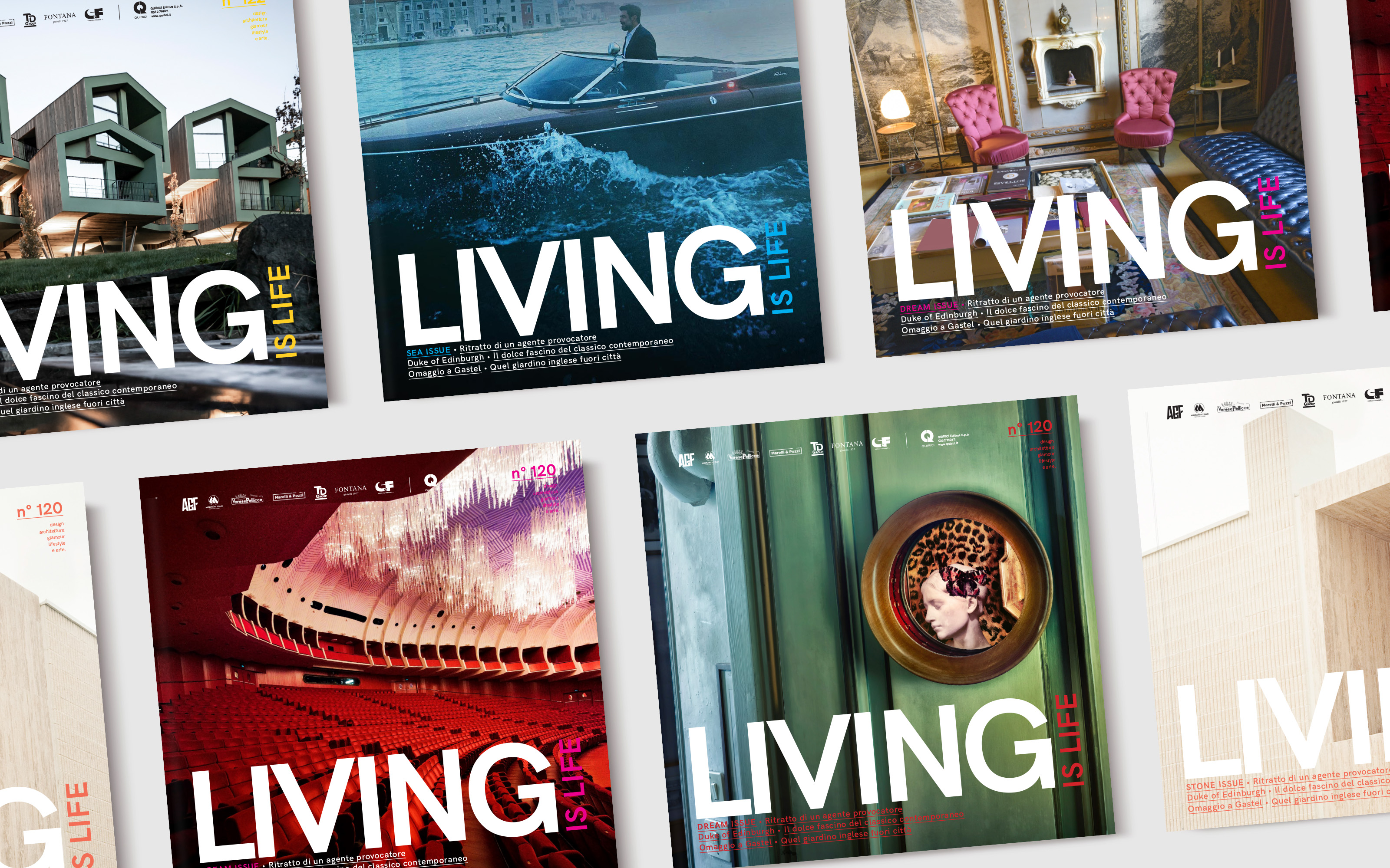
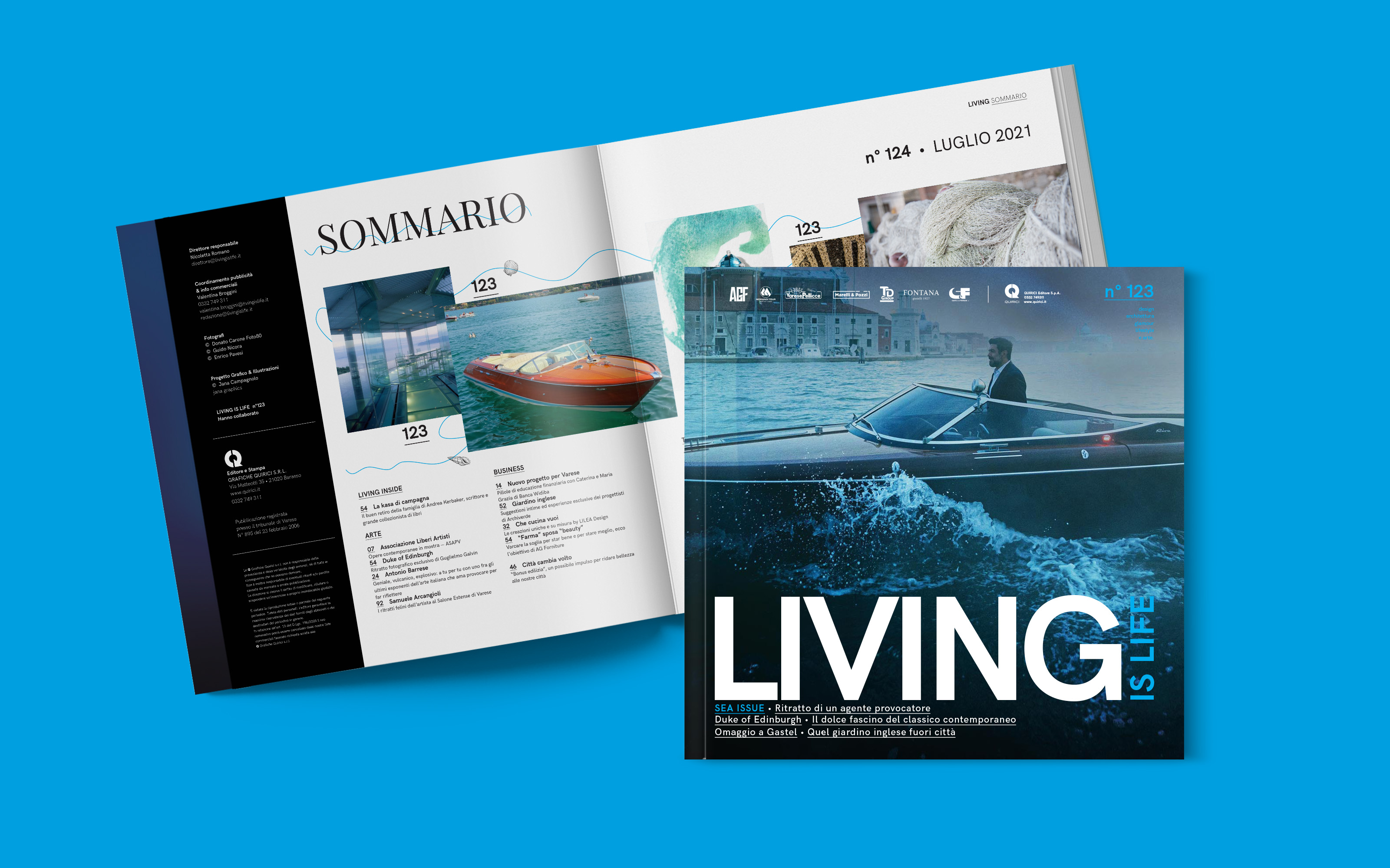
Cover
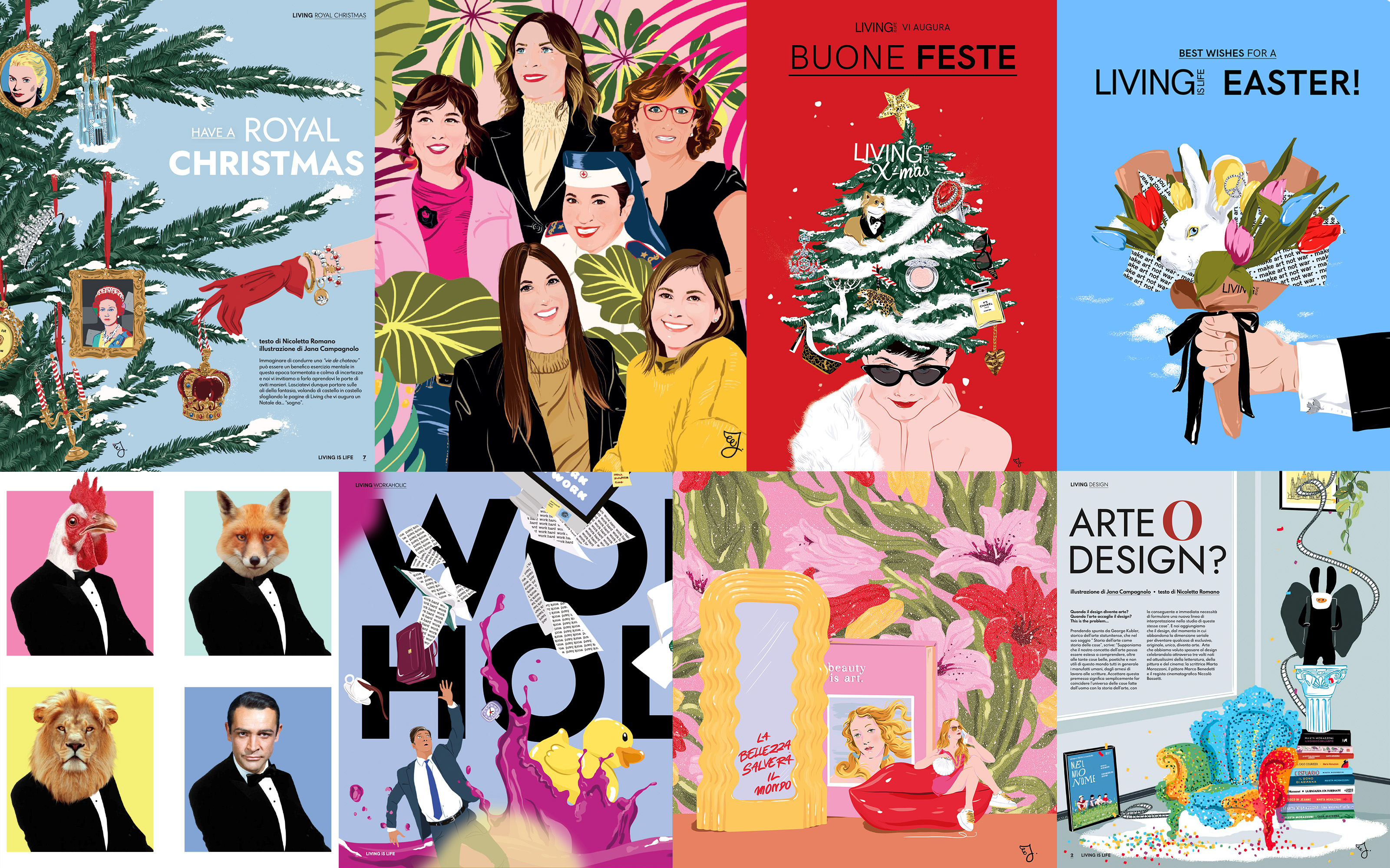
With the introduction of a theme for each issue, the choice falls on a subject/color matched with the issue theme: “enveloping” location with depth, which allows you to “get lost” inside, or a design object with ‘hypnotising’ effect. The logo is brought out by a varnish that enhances the typographic quality of the company, partly white and partly from the color of the issue.

Font&Layout
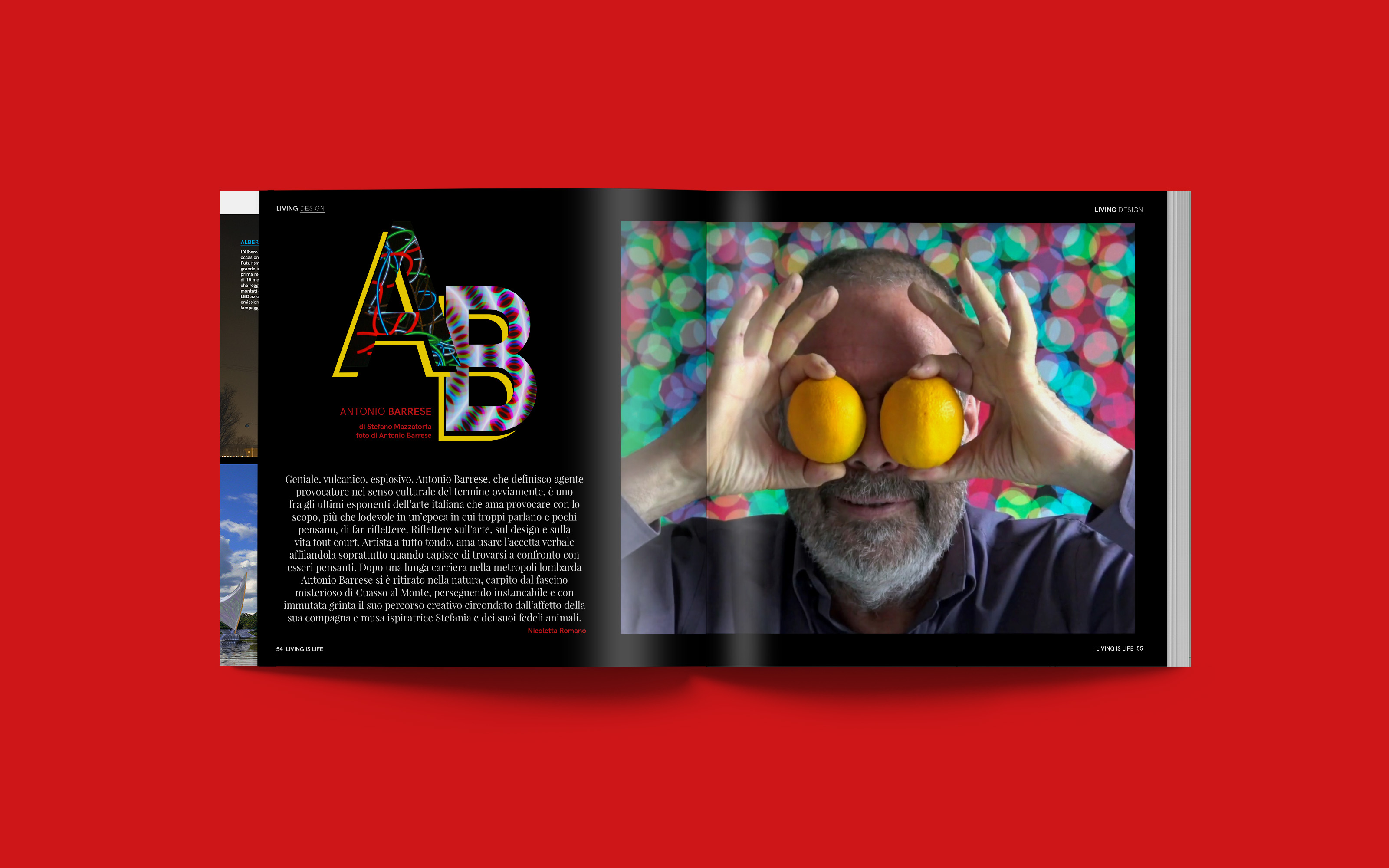
The typographical choice is bold, hyper contemporary. Multiple fonts unite the various souls of the magazine: playful elegance of Playfair Display serif for lifestyle and contemporary Nordic freshness of sans serif HK Grotesk for architecture/design. Choice that reflects the tone of voice: ironic and engaging.
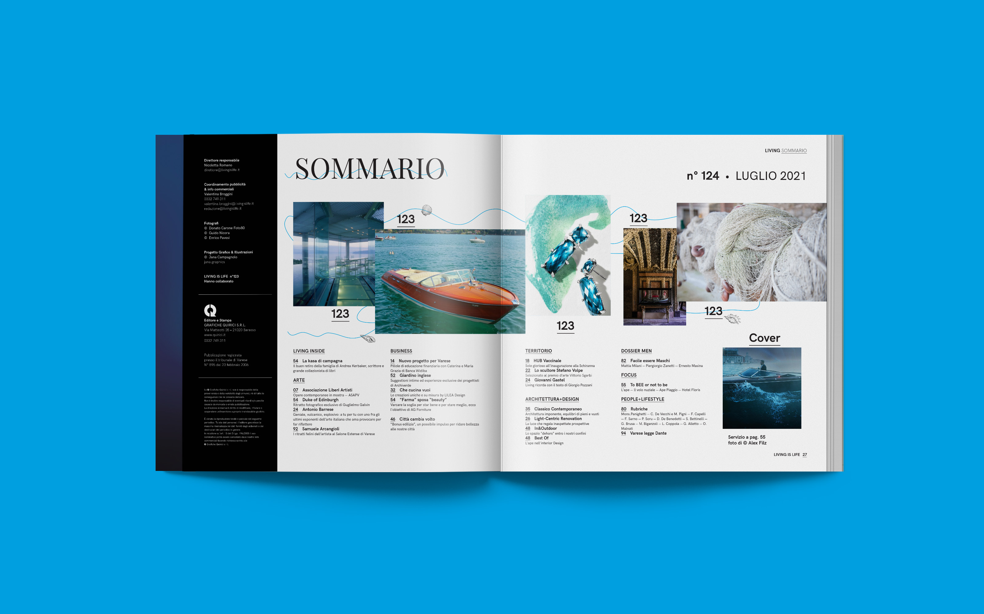
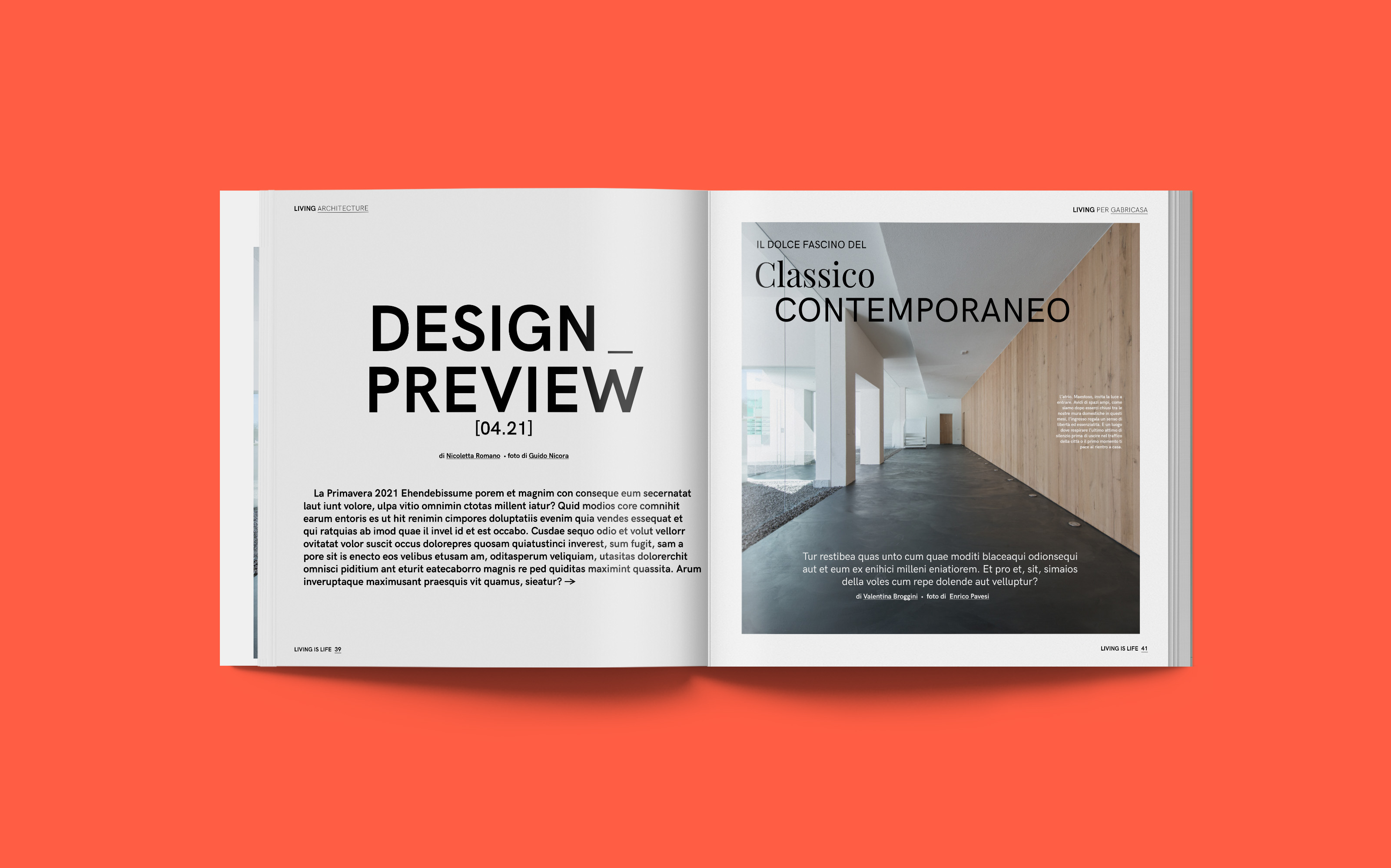
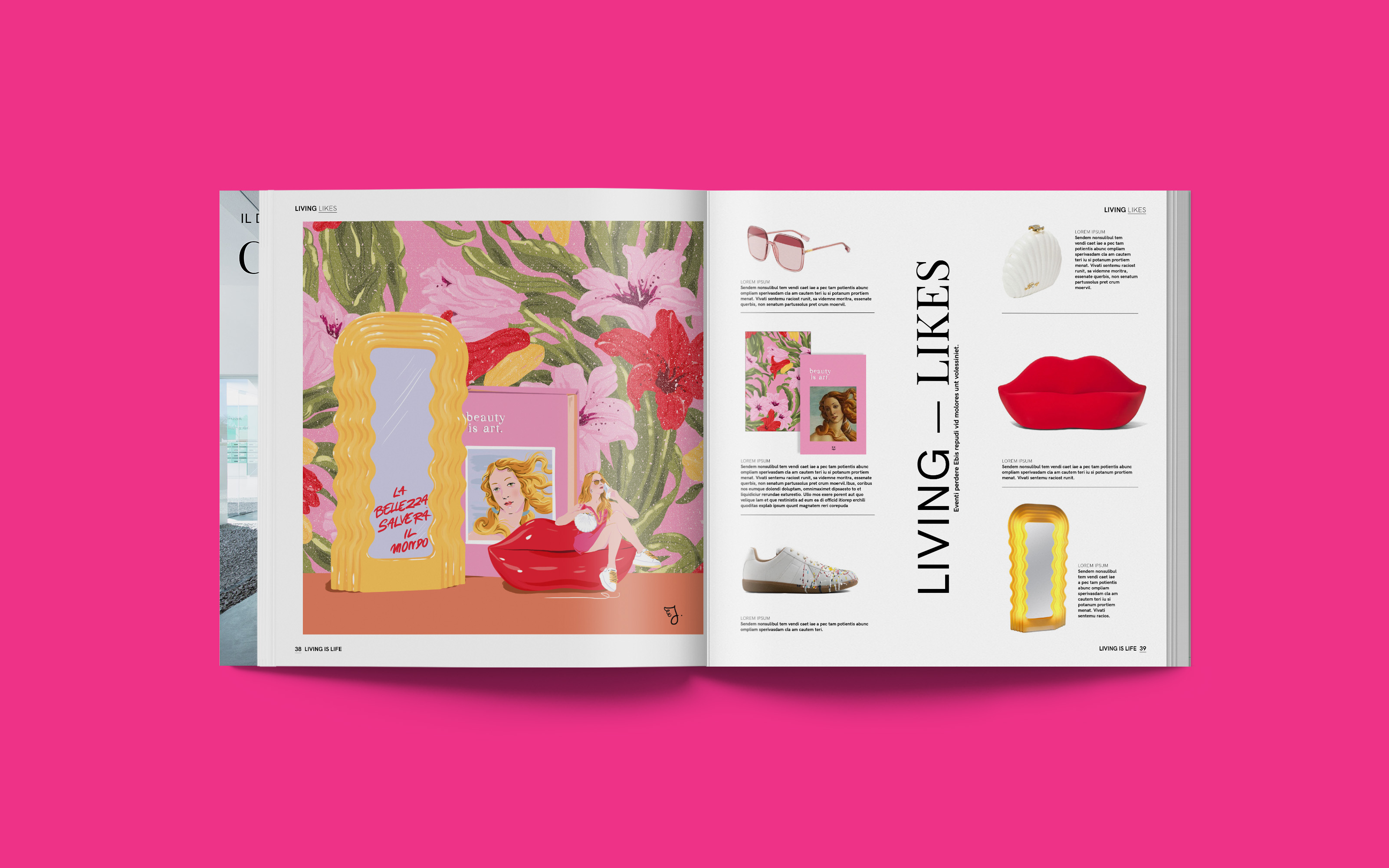
Modular layout 6×6 with blocking maintains consistency between text and images. The reader perceives a sense of order, while vertical lettering makes reading interesting and breaks the monotony.
I introduce creative promotion with shootings that “hide” the advertising nature, avoiding “product catalog” layouts: few and selected photos to arouse curiosity without revealing everything. The goal is never to betray its mission, that is, “living glamour and make you dream”.
Illustrations
Portraits and still-lives with a fresh, pop style, which portray “elitist” imagery close to the fashion system. The illustrations manage to capture the attention of increasingly “impatient” readers and give “character” to the piece, making it unique. They can replace photos in a creative way, giving more space to the imagination. They are dosed and alternated, maintaining the common thread of the issue.
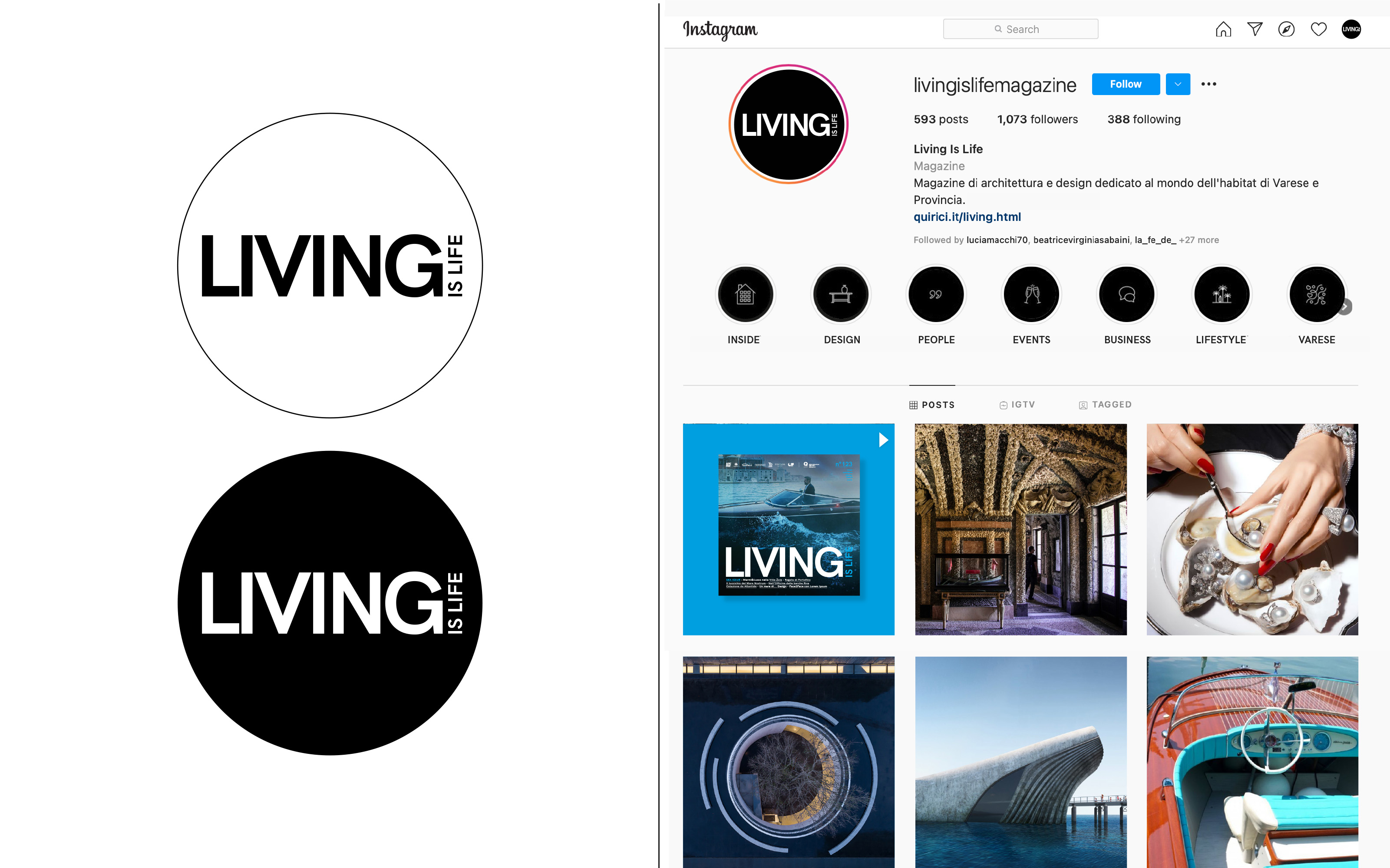
Socials are a showcase for the magazine. Highlight icons and contents are coordinated, always maintaining high attention in the selection and quality of design photos.